


THERE'S been a widely positive reception to the design of New Balance's home and away Celtic kits for the 2015/16 season.
However opinion has been mixed over the new 'Bumblebee' European kit, unveiled this week.
Of course kit designers will never please everyone all of the time - and this effort is far from the worst we've seen Celtic wear down the years.
So what better time to take a look back at some of the more cringeworthy shirts from seasons gone?
January 1989-91 away
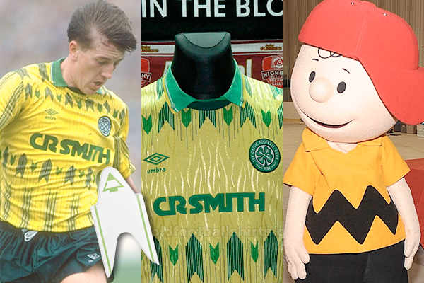 Gerry Creaney gets in line (Pictures: Getty Images; oldfootballshirts.com)
Looking more like a Norwich City home jersey, this always reminded me of Charlie Brown's shirt. Kit designers in the 1980s and 1990s loved pointy arrows, which here are reminiscent of those tickets you get at the butcher's counter in Tesco. It also had some dodgy shiny wavy lines in the fabric.
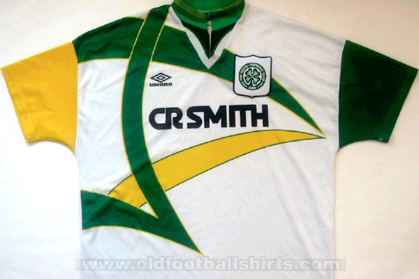
1991/92 away
 Not one of the better efforts (Picture: oldfootballshirts.com)
Like a cross between a mountain range and a financial chart for a poorly performing company, this is regularly featured on lists of the worst kits ever. The mossy splurge on the top and lurid mint on the bottom were separated by an equally incongruous vivid red and blue sponsor for Ford Peoples.
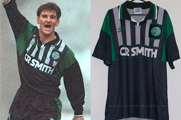
1993-95 home
 Pierre Van Hooijdonk's goalscoring exploits at least distracted from the shirt (Pictures: Getty Images; oldfootballshirts.com)
Celtic’s famous hoops are simple and iconic. Really, there’s not much you can - or should - do with them. Maybe, though, eager designers see this simplicity as a challenge to try and ‘jazz up’ the design. Thick hoops; thin hoops; a mixture of both; thin hoops bunched together to look like one hoop; broken hoops… we’ve seen it all. Usually they get away with it but I was never convinced by this effort. The hoops were too wide, the shirt had Umbro’s logo embossed all over it, while the larger Umbro diamonds printed in the green hoops looked like large boot prints. The designers also couldn’t decide whether to go with a round neck or a collar, so plumped for both. And in case you didn't notice, it was made by Umbro.
1994/95 away
 No. Just... no (Picture: oldfootballshirts.com)
Unless you’re a jester, different coloured sleeves are never a good look. And what’s with the bizarre arrows? They made the shirt look like the uniform of a rubbish delivery company.
1994/95 third, 1995/96 away
 Tosh McKinley tries to hail the fashion police (Pictures: Getty Images; oldfootballshirts.com)
Talk about uninspired. The top half might have been influenced by football nets, but looks more like strips of wire mesh fencing. Really, it's only half a shirt, with the design cut off from the midsection down. If you're gonna design a shirt - even a rubbish one - at least have the courage of your convictions and go the whole hog.
1996-98 away
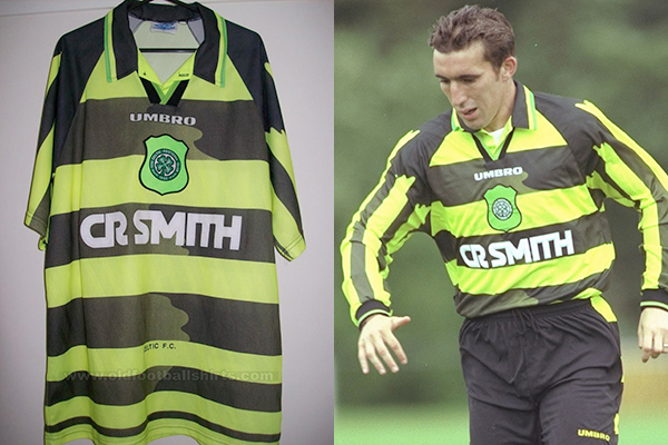 1996 saw the Celtic debut of then record signing Alan Stubbs, and the less-inspiring 'Bumblebee' kit (Pictures: oldfootballshirts.com; Getty Images)
A controversial choice as it’s a cult fans’ favourite, but the original ‘Bumblebee’ never created a buzz with me. Like the new incarnation, the narrowing hoops from top to bottom gave it an unbalanced look, while the faded areas made it look as though you’d accidentally put it on a high wash. Loses further marks for the black ‘bleeding’ on the sleeves.
1998-2000 away
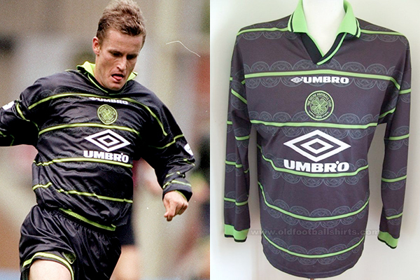 Terrible. The shirt wasn't much better... (Pictures: Getty Images; oldfootballshirts.com)
After two years of the 'Bumblebee' we got this monstrosity, which I have to admit I actually paid money for. Shiny black and lime green is never a good look, but the alternating rows of half crests marching across it made it look like a printing error at the factory. Another two-year run here (albeit with a different sponsor each season) so at least I got my money’s worth.
Thanks to the guys at oldfootballshirts.com for the images.
Don't agree with our selection? Let us know your best and worst Celtic kits in the comments section below.
See More: Celtic, Football Jersey, Football Shirt
