THE new logo for Irish drinks giant Guinness, designed by a London firm, has been unveiled.
The Irish company commissioned brand design agency Design Bridge for the latest logo.
The new design takes the renowned Guinness harp back to a more traditional look, with "sharper, more detailed features".
It also puts the "Estd. 1759" text that has been on all of the brand's logos on the harp.
Design Bridge has also changed the font.
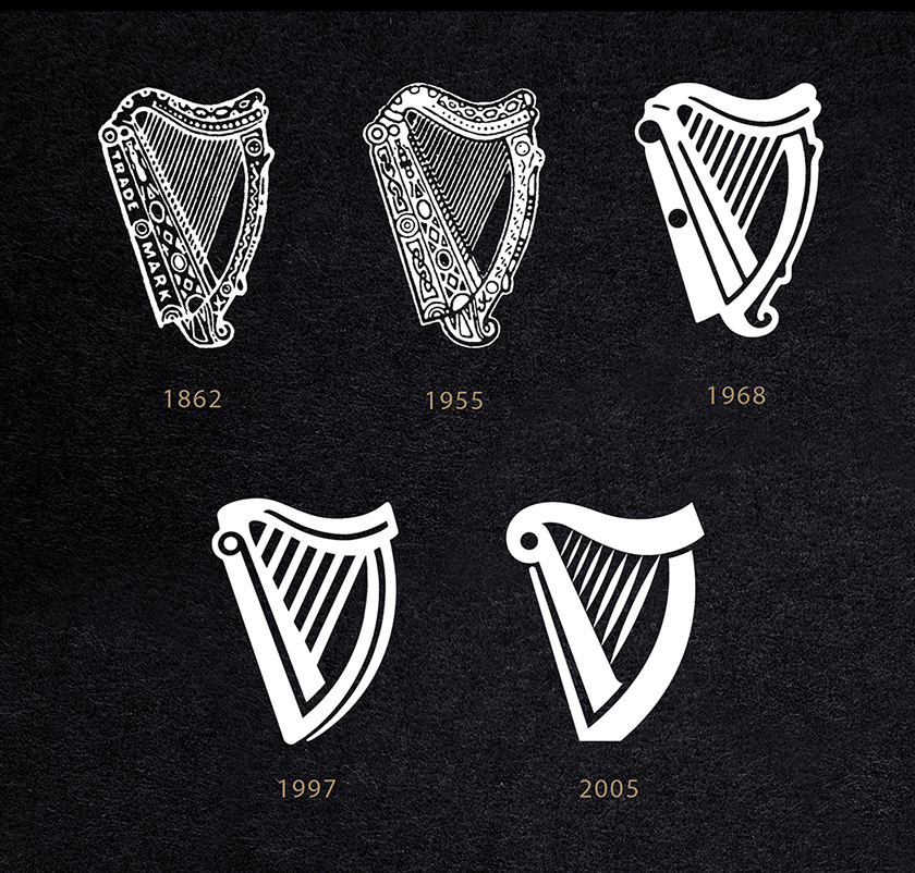
The harp has been used as its main logo since 1862 and it has become synonymous with the brand.
"The Guinness harp was originally based on the legendary ‘Brian Boru harp’, a powerful symbol of Ireland’s national identity and heritage", said Mark Sandys, Diageo Global Head of Beer and Baileys.
"In keeping with the Guinness ‘Made of More’ ethos, we have reintroduced a special handmade quality to the harp to reflect the experience, craftsmanship and passion that we put into brewing our Guinness beers."
Design Bridge said in a statement: "It's not often that you get to re-design one of the world's most famous brand marks, so this project was a real labour of love and a shining example of our creative philosophy".
"We hope Arthur Guinness would be proud."
Check out how the Guinness logo has changed over the years:
 Guinness logos through the years. (Picture: Design Bridge)
